Serving as the front door to your intranet, a well-designed homepage will engage employees and help them navigate smoothly through the intranet. Likewise, a cluttered (or ugly) design often equals a poor user experience which causes your intranet to fail.
In other words, your homepage design has a big impact on making or breaking your intranet adoption.
So how should you design your intranet? What elements should be on the homepage and how do you present them in an appealing and intuitive way?
In this blog post, we dive into 4 intranet homepage ideas that offer a great user experience. But before we do, let’s discuss the golden rule in intranet design.
The golden rule in intranet design
Certainly, it’s good to make a stunning and aesthetically pleasing design. But that’s not enough. Your most important task is to create a user-friendly and well-functional intranet for your employees.
To achieve that, it’s important to put users (or employees) at the center of your intranet design and development. We call this approach the user-centered design.
It requires a clear understanding of users, their needs and wants, behaviors and task requirements.
You’ll need this information in order to choose the right features, build the intranet navigation, design the user flow, and decide what elements or content sections to put on the homepage. The goal is to create an intranet in which every page engages employees.
As organizations from different industries have different needs, and their workforce has different challenges and struggles, the best intranet design must take account of these differences.
That’s why we’ve selected 4 intranet homepage designs from 4 sectors with vastly different needs as examples.
Intranet homepages for the public sector
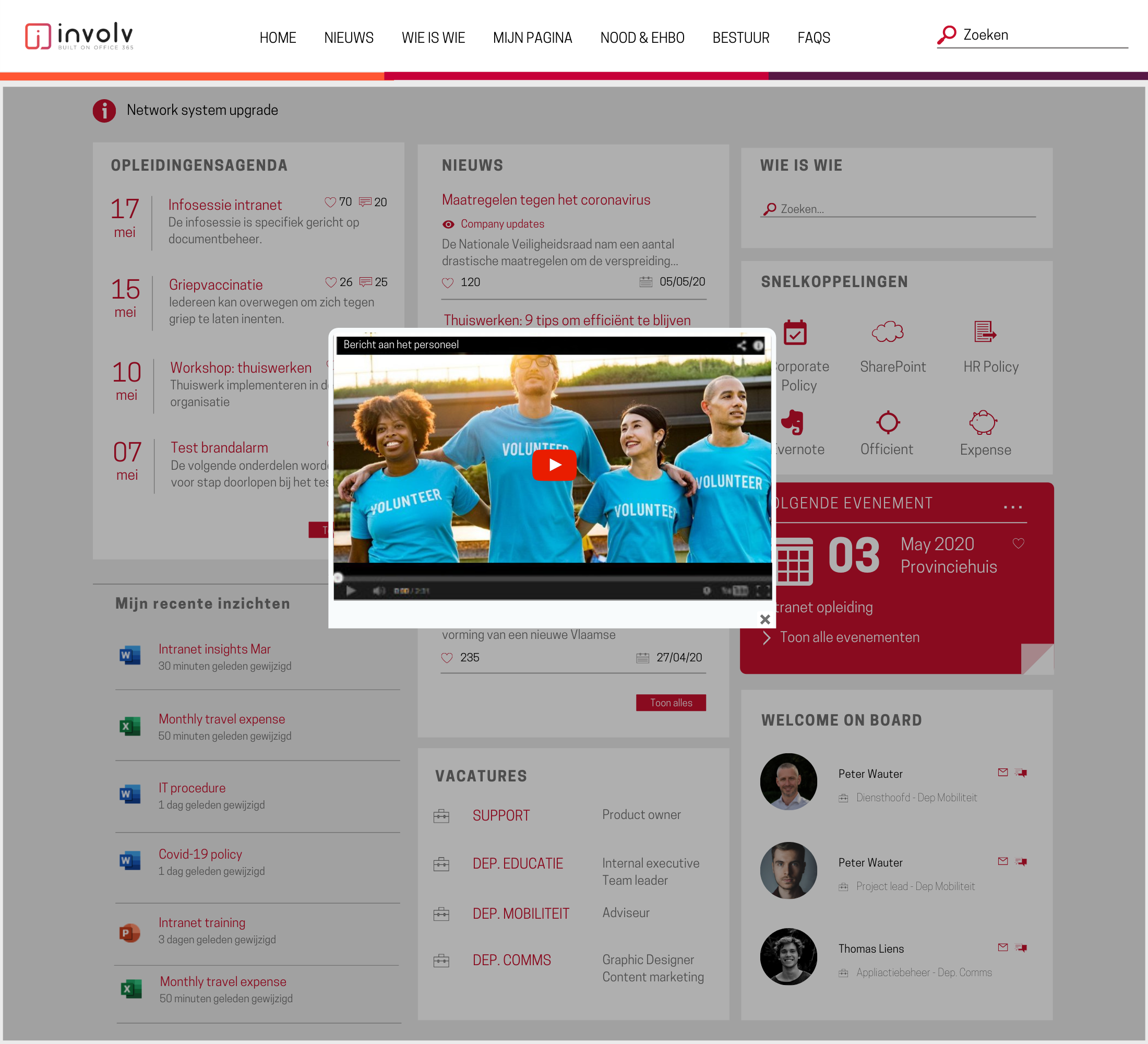
Local governments are likely going with a more news-focused intranet homepage. But it doesn’t necessarily mean a heavy-text layout.
Short and clear headlines, combined with a good color contrast between headlines and intro text, provide a comprehensive and easy-to-read overview of all the announcements and updates.
There are more elements that make this specific intranet homepage design engaging:
-
- A video popup helps communicate news in a more interactive way. In fact, video is a very effective communication tool as employees are likely to retain 95% of messages when they watch a video.
- The event calendar displays all the upcoming internal training sessions and workshops. This is important in an industry that continuously focusses on developing the skills of its personnel in order to improve organisational, team and individual performance.
- The use of a consisting branding across all the intranet sites from the homepage to department pages and others ensures consistency reinforces the brand identity. For those organizations that do want to apply a different styling for each department, that’s equally possible.
- The people directory on the top right corner helps to search and find everyone in the organization. The smart search functionality enables users to search colleagues by name, department and skill.
- The internal jobs widget is useful for internal recruitment. This gives employees a chance to advance their career within the organization.
- And of course, let’s not forget to welcome new hires.
On a side note; although the intranet homepage is the first page most users will see, it does not mean they should all see the same information. Every component can show targeted content for specific user groups. The homepage can even provide an overview of the documents people have been working on. And as Involv is built on the M365 framework, these documents immediately open in their favorite apps.
Intranet homepages for hospitals and healthcare providers
For healthcare workers, it’s particularly important to be able to quickly access the right information. A hospital intranet homepage must therefore serve as an effective, easy-to-navigate map to all documents, files and data.
Also, hospitals have lots of staff and departments. Support and admins, physicians, nurses and other hospital staff have different needs and access to technology. The intranet homepage should reflect this. Elements on the homepage such as news and links must be customized to the user’s role and department to ensure relevancy and engagement.
Here are some key elements that ensure an engaging hospital intranet homepage.
-
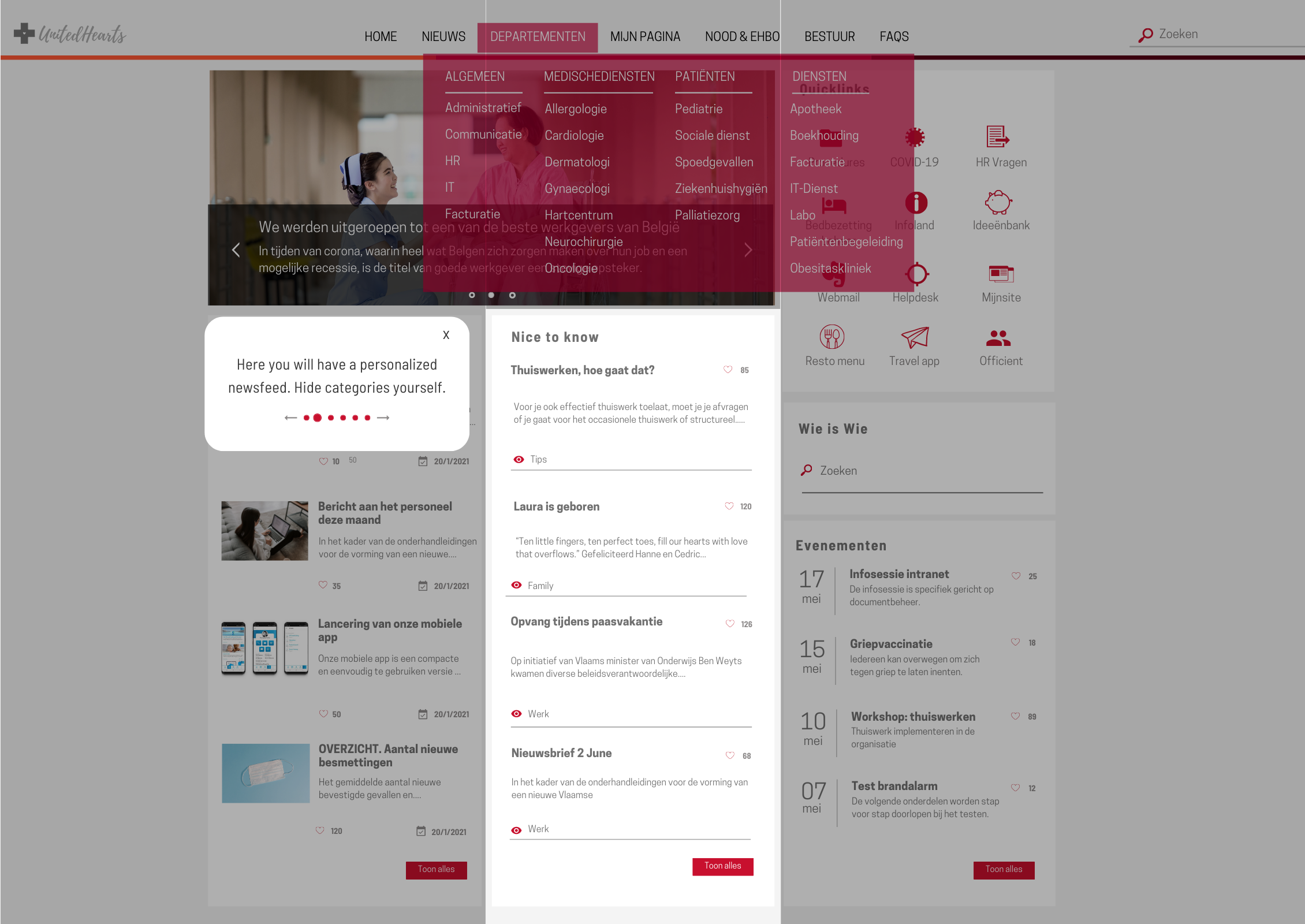
- The comprehensive mega menu provides easy access to every page of the intranet, helping users to quickly find exactly what or who they need.
- The welcome tour helps to onboard the intranet users faster by guiding them through the most used components.
- The news carousel at the top features the most recent and important announcements and updates, taken from the news page within the intranet.
- The newsfeed has 2 divided sections: ‘need to know’ and ‘nice to know’. This helps employees to keep track of crucial news while still keeping up with other interesting but less important information.
- The quick links provide fast access to procedures and forms, workflows and applications used in hospitals such as bed occupancy, infoland, etc.
- The who is who facilitates cross-functional collaboration, as it helps people to quickly find everyone working in the hospital, based on their departments and skills.
The Involv healthcare intranets are often integrated with other tools. A connection with Zenya (Infoland) – a popular quality and risk management tool – for example makes all information searchable from within the intranet, whether the information lives in the intranet (SharePoint) or Zenya.
Intranet homepages for non-profits
For non-profits and charity organizations, ensuring everyone is aligned and connected with the mission and purpose of the organization is crucial. From our experience working with organizations in this sector, we know there are two important things they look for in an intranet.
1. The intranet must have the ability to share news, stories and best practices.
2. The intranet must have the ability to connect everyone from employees to volunteers.
Nonprofits may accomplish an engaging intranet homepage design with:
-
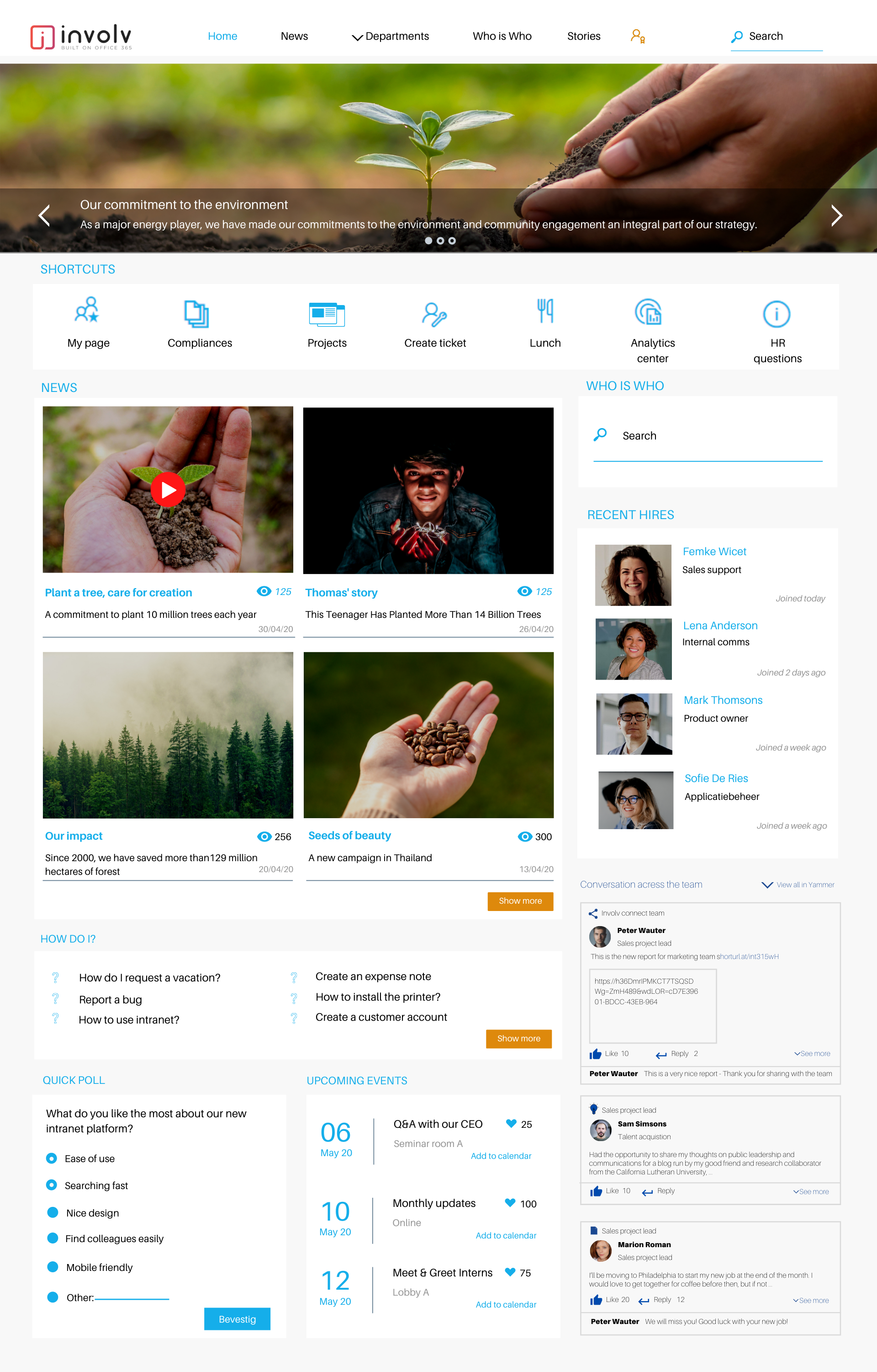
- A newsfeed with inspiring visuals that shares news and updates, stories and achievements, successful campaigns and activities. Promoting positive outcomes and impact of the organization helps to inspire and motivate employees.
- A staff directory brings employees and volunteers together regardless of location. Everyone is just one click away from each other.
- The Yammer feed displays all conversations. People can post directly from the intranet homepage.
- The “How do I” section offers guidelines on how to complete tasks and answers repeated questions. This helps to free up time for the HR and IT department.
- A poll or survey allows organizations to listen to ideas and feedback of all employees and volunteers.
Intranet homepages for real estate & construction
Real estate & construction organizations have several unique internal comms challenges because a high proportion of the workforce does not work at a desk. Besides, construction workers are often dispersed across different job sites, at all hours of the day and night, with no access to a computer. It is therefore a challenge to connect and engage with these workers.
It’s a best practice that construction companies have an omnichannel approach in their internal communication strategy. Many use a modern communication platform like Involv as it integrates different channels including email, desktop, mobile and even offline (thanks to Involv Cast) in one single application. This helps organizations reach and engage every employee, but it also avoids miscommunication since all information and communication is centralized within the company intranet.
Now, let’s take a look at what elements make a great intranet homepage for construction companies.
-
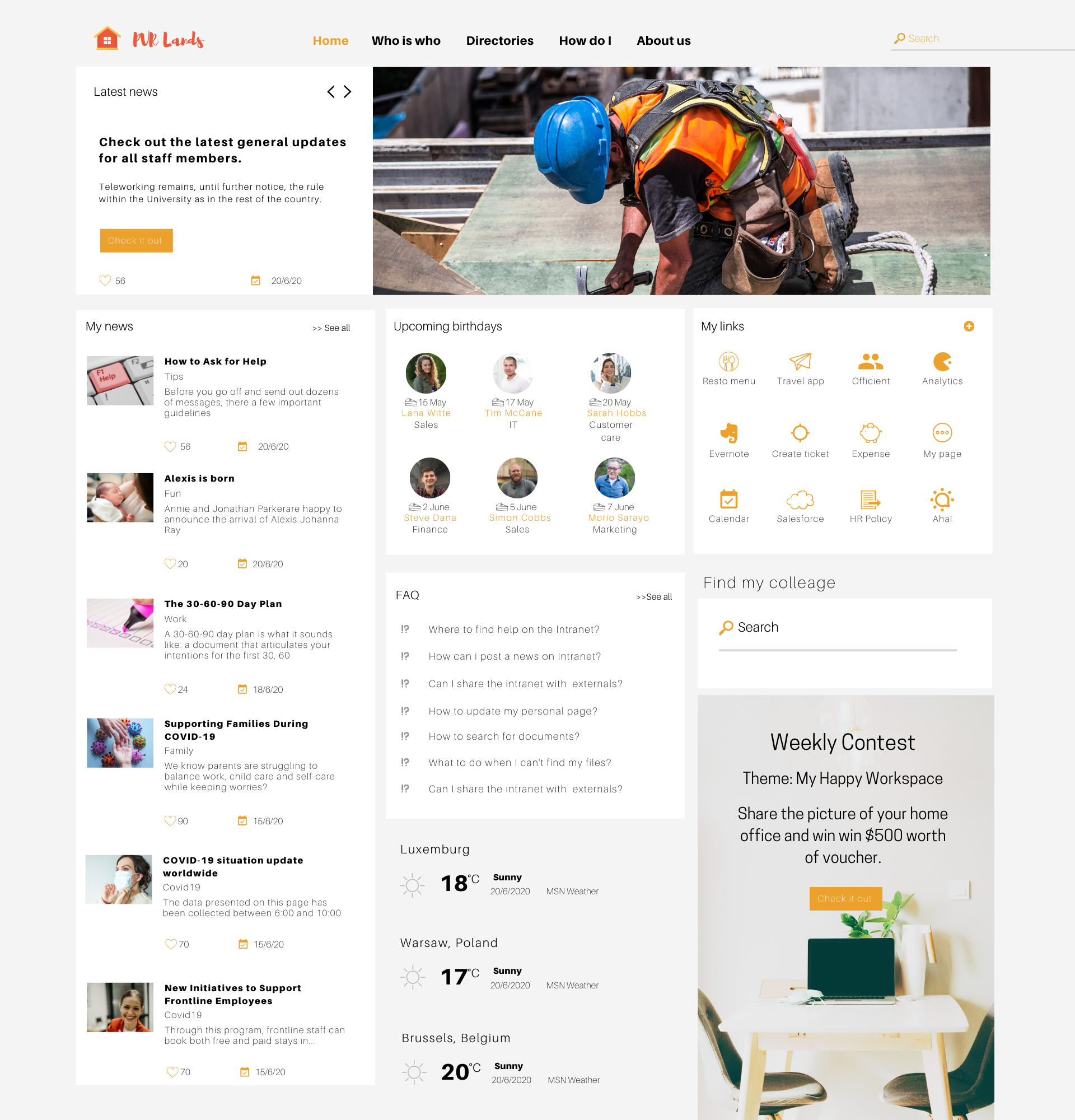
- A spotlight area on top of the homepage which features important company news and updates. The big headlines, intro texts and the prominent image on the right draw everyone’s attention.
- A personalized newsfeed shows relevant news articles. Users can choose what news categories or topics they want to see on their homepage.
- The upcoming birthdays section reminds people of their colleagues’ birthdays – a great way to foster good work relationships and embrace a positive workplace culture.
- A prominent visual of internal activities or events ensures that everyone knows about it. The strong call to action encourages people to join it.
- A well-designed quicklinks section with direct links to most-used applications or content areas. Employees can edit this section as they please.
- The FAQ feature centralizes all questions around a certain topic in one place, helping employees to find answers easily.
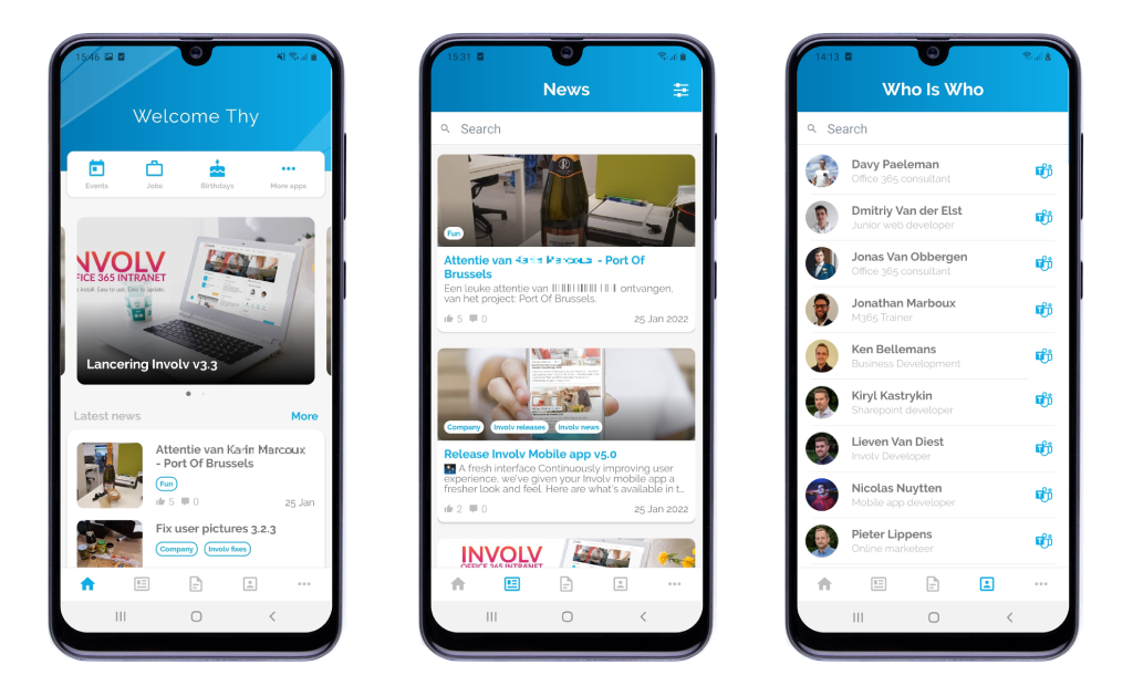
These elements are also available in the Involv mobile app. With the app on their smartphone, non-desks workers can stay up-to-date with all company news, access the employee directory and HR forms, keep track of their emails and calendar, etc. They can even upload pictures and news from their mobile phones.
Designing the best intranet for your employees with Involv
From my experience in deploying hundreds of intranet projects in different industries, I believe having a well-designed homepage is crucial to achieving a high user adoption.
I hope I was able to inspire you with these intranet homepage ideas. If you need any help in (re)designing your intranet, let’s get in touch.
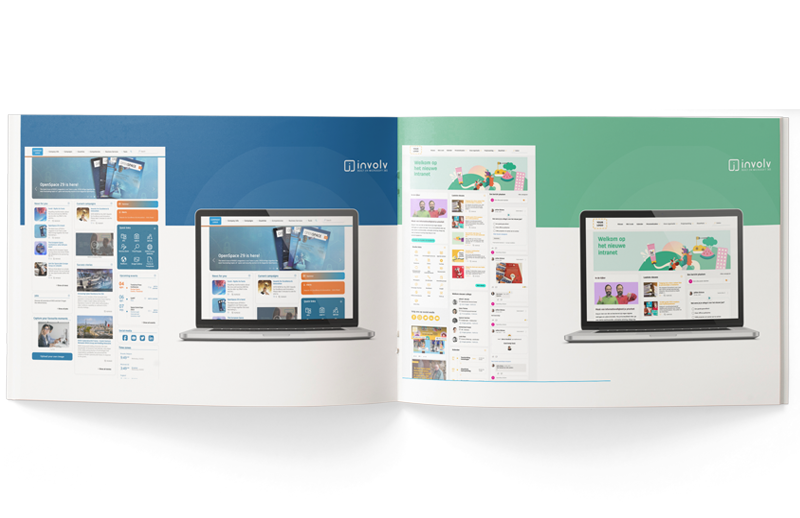
For more intranet design inspiration, download our Involv Look Book where we compile 11 Involv homepage mockups. These are all based on actual Involv environments.

Tim Bogemans
Your Plan for Maximizing Employee Engagement
-
STEP 1. SCHEDULE YOUR DEMO
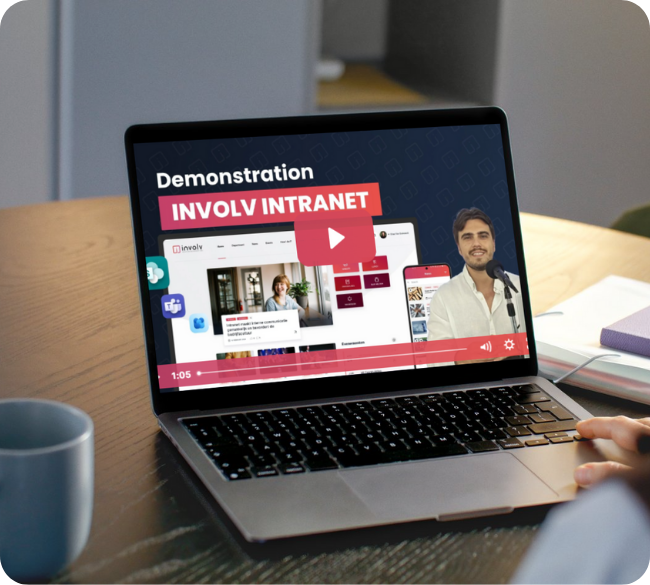
Get a demo and gain valuable insights in how the Involv intranet builds adoption.
-
STEP 2. CREATE A ROLLOUT PLAN
Together we co-create a rollout plan tailor made for your organization.
-
STEP 3. LAUNCH YOUR INTRANET
You’re all set to launch your intranet and get everybody involved.
-
STEP 4. ACHIEVE HIGH EMPLOYEE ENGAGEMENT
Use your Involv intranet to communicate effectively and engage employees.
