An intranet is no longer just a storage space for documents and policies. In 2025, it plays a crucial role in the digital workplace, serving as the central hub for internal communication, collaboration, and productivity. In doing so, the intranet homepage is often the first impression and the most important access point for employees.
There is no one-size-fits-all homepage design, as it should be as unique as the organization and its employees. However, certain elements can make the difference between an engaging, useful homepage and a digital wasteland.
But how do you ensure that your intranet homepage truly makes an impact? An effective intranet homepage must be intuitive, visually appealing, and functional. In this blog, we’ll explore the key elements of a successful intranet homepage, along with the latest trends and best practices.
1. Simple and Clear Structure
An intranet homepage should not overwhelm users. A minimalist and well-organized design helps employees quickly find what they need. Ensure that essential information, such as company news and frequently used tools, is immediately visible without excessive scrolling.
Less is more! Be selective about what you display on the homepage and prioritize the most important information at the top.
2. Intuitive Navigation
A well-structured navigation system helps employees work more efficiently. Limit the number of main menu items and use a clear hierarchy. Dropdown menus and search functions make it easier to find the right information quickly.
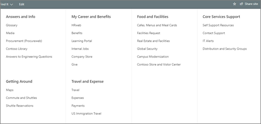
Experts recommend having only 5-7 main navigation items. If your organization has a lot of information, data, and links, consider using a dropdown menu or a mega menu.
*Mega menu: a large panel that expands from the navigation menu, offering a wide range of options.

3. Personalized and Relevant Content
Not every employee needs access to the same information. By applying personalization, such as content based on department, location, or role, you increase relevance and engagement. Dashboards displaying key metrics, project updates, and relevant announcements for specific teams are highly effective.
With the ‘target audience’ feature in Involv, you can display the right content to people within a specific team, location, or department.
4. Mobile Accessibility
With the rise of hybrid and remote work, an intranet must be accessible anytime, anywhere. A mobile-friendly design, or even a dedicated intranet app, ensures that employees can log in and communicate effortlessly while on the go.
The Involv app is customizable to match your company’s branding and is available for both Android and Apple devices. Check out the Involv mobile app brochure to explore its features.
Planning your intranet project
Planning a new intranet project? What steps to take to build an effective intranet? Download our free whitepaper.
5. Visual Elements and Micro-Interactions
A boring, text-heavy intranet page is a thing of the past. According to Forrester Research, people are 75% more likely to watch a video than read text.
Utilize visual elements such as videos, infographics, and interactive widgets to enhance the user experience. Micro-interactions, such as animations and hover effects, also create a dynamic and engaging platform.
6. Consistent Branding and Corporate Culture
An intranet homepage often reflects the company culture and helps employees feel at home in the digital workspace. Ensure that the look and feel of the intranet align with the company’s visual identity. But don’t stop at the homepage—extend branding throughout the entire intranet to create a cohesive, recognizable, and professional environment.
7. The Importance of White Space
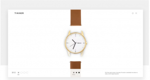
White space—the empty space on a page—plays a crucial role in both design and user experience. Think of it as a breathing room that adds structure and directs employees’ attention to key elements. Proper use of white space creates a clean, organized look and makes it easier to process important information.
Don’t be afraid to leave space between content and visual elements for a pleasant and efficient user experience.
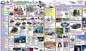
See for yourself what captures your attention in the images below:


Conclusion:
An effective intranet homepage is not just an information portal, it is a vital part of the digital workplace. By focusing on simplicity, personalization, visual appeal, and integrations, you can create a platform that truly supports employees in their daily tasks.
Want to find out how your organization can get the most out of its intranet? Contact our experts and explore the possibilities!

Tim Bogemans
Try it out today
01.
start your demo
Request your personal demo with our intranet expert and discuss how Involv can help you reach your organizational goals.
02.
enroll
Like what you see? Setup your ready-to-go digital workplace in less than 1 hour, without any technical knowledge.
03.
success
Employees will love what they see, as Involv integrates with all the tools they already know and use. Need more? Contact us!


